TL;DR
- $100M spent to fix the wrong problem. Gap thought the logo was the issue. It wasn’t.
- No clear decision to defend. They tried to please new customers without losing old ones and pleased no one.
- Indecision stripped the brand of personality. Endless revisions led to a bland, forgettable result.
Result: Massive backlash. Reversal in under a week.
Why it matters: You can’t design your way out of a strategy you haven’t decided on.
📌 Tip: The Upsidedown Framework for better decision clarity and conversions.
Background
In 2010, Gap faced the exact same paralysis as the Duffer Brothers, but with a much faster (and more expensive) collapse.
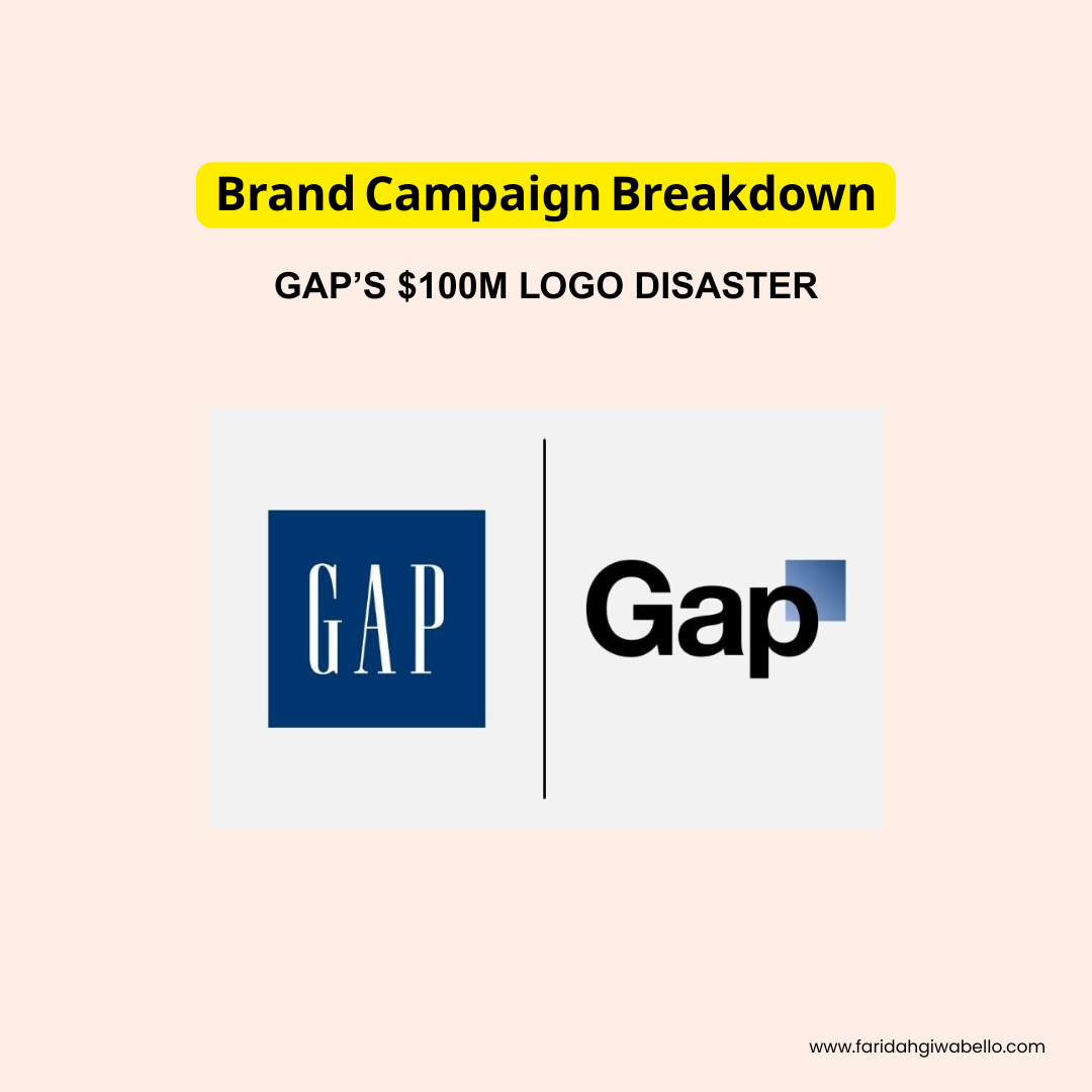
After the 2008 financial crisis tanked their sales, Gap’s leadership panicked. They needed to “do something, and quick.” So they spent an estimated $100 million to redesign their iconic blue box logo that had represented the brand for 20 years.
Why It Failed
- Failure to Uncover What They Were Avoiding: The actual problem wasn’t the logo, it was their product line feeling bland and directionless.
- Not Picking One Person: They tried to modernize for new customers while keeping old customers happy. The result satisfied neither group.
- Got Lost in ‘What Ifs’: Focusing on whether they look dated or if the logo is the problem is just a distraction from the real issue.
- Had No Deal Breaker: If they’d said “we cannot alienate our core customers,” the project would’ve stopped immediately.
- Couldn’t Decide, Then Defend: When backlash hit, they immediately asked for “other ideas” and tried to crowdsource their way out.
- Were Stuck in Revision Loops: The final logo looked like something created in Microsoft Word because it went through endless rounds until all personality was stripped out.
The backlash was instant. Within 24 hours: 2,000 negative Facebook comments, 5,000 anti-logo Twitter followers, and 14,000 parody logos mocking the redesign. They reversed their decision in less than a week.
The Lesson
Gap’s failure wasn’t about design. It was about treating a rebrand like a reveal instead of a relationship shift. They tried to skip the hard part: actually deciding what Gap stood for in 2010.
The UPSIDE DOWN framework exists because Gap proved what happens when you don’t use it. You can learn about it here.
Next Steps
- Sign up for The Marketing Pulse for real-world strategy insights, examples, and execution-ready takeaways.


